Over the past several weeks, I’ve been Twittering about a new application that has been under construction. I’m happy to now lift the sheet and share what I’ve been working on.
The application is called “Task Views” and it attempts to solve the problem that modern workers face when managing their tasks and todos. There are a variety of great task management applications (desktop and web alike), but the realities of the modern workplace is that we find ourselves using a variety of solutions to attack the same problem: getting things done.
In my own personal life, I use FogBugz to track software tasks, a Basecamp site to collaborate with clients, and OmniFocus to handle everything else. The problem with splitting things up in this way is that it leads to tunnel vision. When I’m working in FogBugz, I’ll plow through a variety of software issues, while forgetting to pick up groceries on the way home. When I’m in OmniFocus, I find it easy to overlook urgent tasks for my Basecamp client. I get things done, but often find my triumph short-lived as I discover that I didn’t do everything I needed to do, simply because I forgot to look at my other task applications.
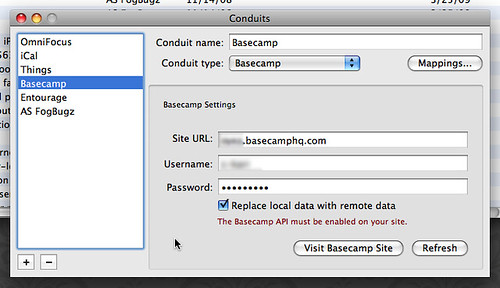
Task Views solves this problem by offering a set of unified views that transcend individual systems. The program accomplishes this using conduits. A conduit is a bit of code that pulls tasks from another system, normalizes the fields, and imports it into the current system.
Task Views currently talks to OmniFocus, Things, iCal, Basecamp, Entourage, and FogBugz. (Support for other systems is in the works.) The conduits fetch task information and dump it into a local database.
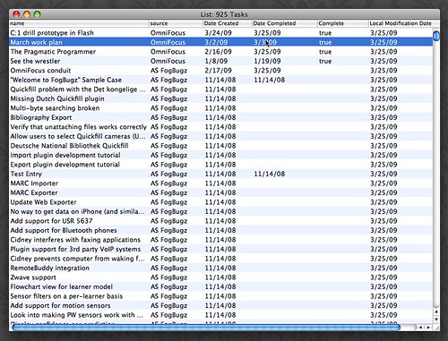
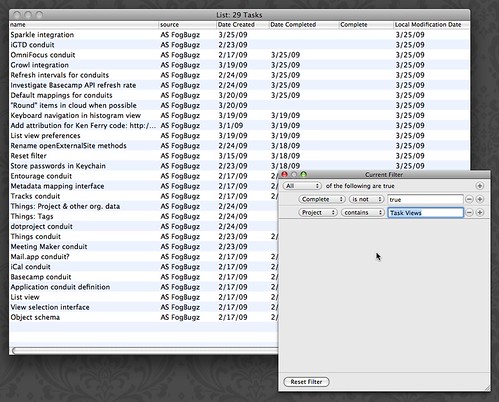
The program provides a very basic list view that allows users to quickly identify and view individual tasks. However, as the image above shows, this list can grow really long, really quickly. To alleviate this problem, Task Views provides a filtering function that allows users to select subsets of the database:
Users can construct elaborate filters by using simple Boolean rule-based logic.
The list view shows the main weakness of the current crop of task management applications. Almost without exception, all of them use a list metaphor to display what needs doing. Even on the largest monitors, tasks scroll off the visible screen rather quickly.
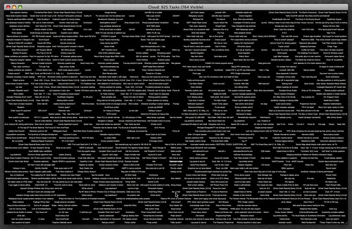
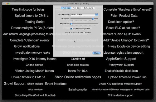
A cloud view provides a simple way of displaying more content in a more space-effective manner. Where as the list above shows less than a hundred items, the cloud view shows over seven hundred. However, the items are so small, that this view is clearly suboptimal.
Task Views allows the user to bind the size of the text to a numeric or date value associated with the tasks. In the screenshot above, the date the tasks were created is bound to the text size. Tasks created farther in the past appear larger than more recently created items.
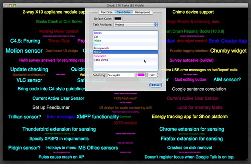
Categorical and text values may be bound to the color of the text items. In the screenshot above, I’ve bound a variety of colors to various projects. Color makes salient which projects need more attention than others.
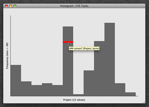
In addition to the list and cloud views, Task Views also provides a histogram view of the task space.
The view above shows the number of tasks associated with particular projects. As the cloud view demonstrated, I have many tasks still associated with the Jarvis project.
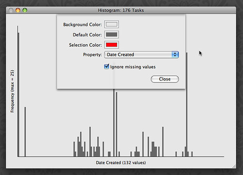
The histogram view also provides a useful temporal perspective of the task space. In the image above, the height of the bars represent how many tasks were created on a given day. This could as easily show how many tasks were completed within a particular duration in order to better understand personal productivity patterns.
Not pictured above are the task update notifications. Task Views periodically refreshes itself and when a task changes, the application will alert you using an unobtrusive Growl notification. This is useful for discovering that a coworker has elevated the priority of particular item without taking the time to inform you.
In upcoming releases, I plan to add new views that draw upon the data visualization research and literature.
The Context Angle
Since this blog is focused on context-aware computing, there is a context angle here. I speculate that while Task Views provides a variety of views and configurations, not all of them will be appropriate in all cases. A large histogram view may be useful for when the user is planning their week, but a smaller cloud view my be more appropriate throughout the working day. Task Views is explicitly designed to be dynamically reconfigured using systems like Pennyworth. Currently, the context-sensitive portions of the application are
1. The active filter: The list of visible tasks may vary with the current activity. For example, when programming, show the incomplete items from the FogBugz database. When collaborating, show items from Basecamp. When planning the upcoming week, default to OmniFocus.
2. The active view: A larger histogram is useful when explicitly planning. When doing other things, a more ambient cloud view may be more effective.
3. Individual view configurations: Date histograms may be more effective when planning, while categorical histograms may be more effective when triaging. In some cases, it may be useful to bind the size of the text in a cloud view to the date, in other cases, priority.
At the moment, I’m in the process of prototyping and testing this system with users with ADHD. If you’re interested in testing it yourself, post a note in the comments and I’ll get back to you. The software isn’t quite ready for release yet, but I am interested in recruiting more testers.

